
Rockin' Around...
The Christmas treeNovember 25, 2025
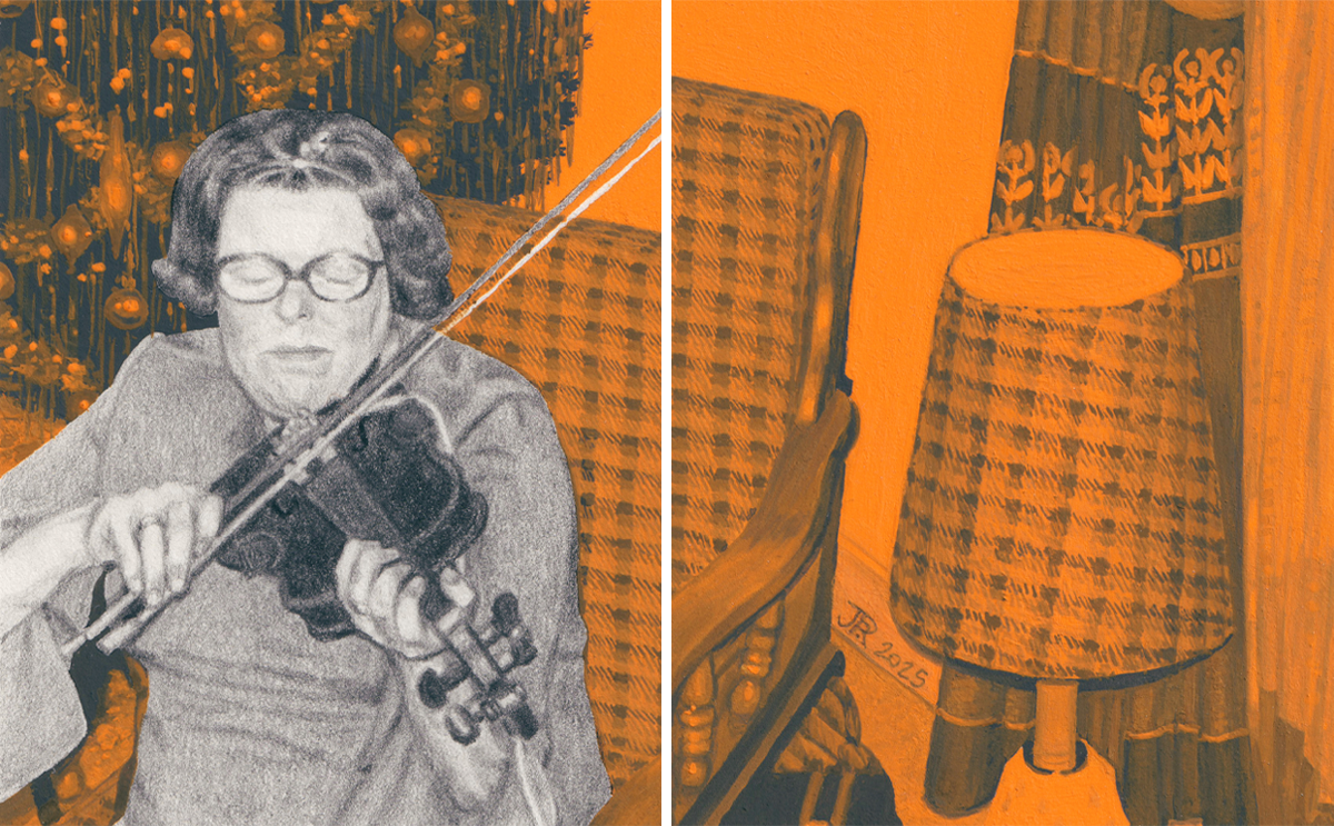
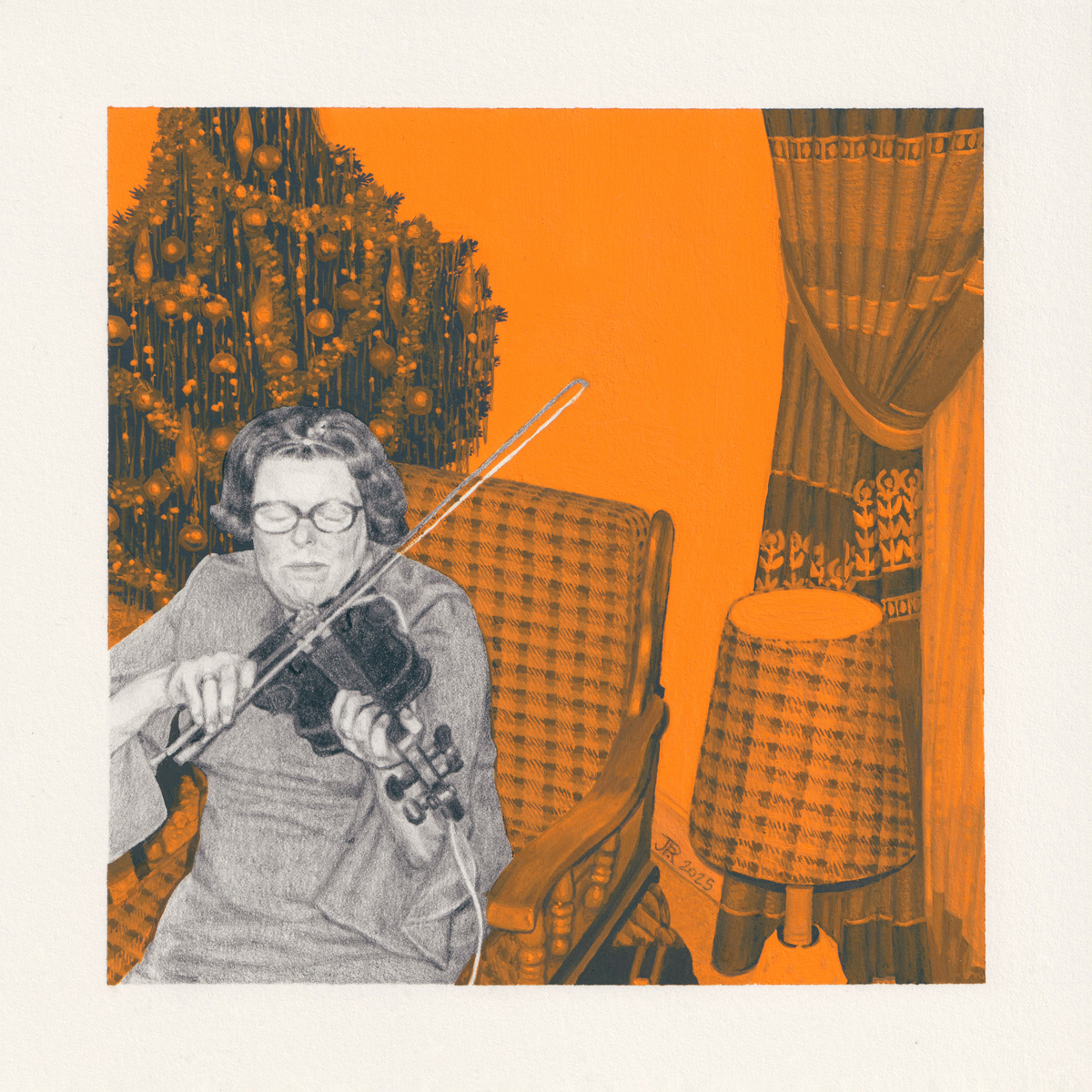 Le Violon, 2025. Graphite pencils and acrylic gouache on paper
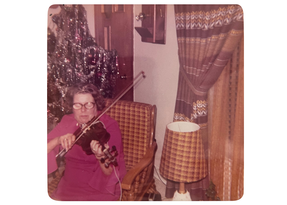
The house was filled with people dressed up to the nines for the Christmas celebrations. There were guests in the kitchen, in the lounge, in the basement (the teenagers mostly). These people had eaten all the food and were now diligently making sure that by the end of the evening there wouldn’t be a drop of alcohol left in the house.
Dolo didn’t drink much. She didn’t need it to have fun. Case in point, her cheeks were currently hurting from laughing so much. The stories had been especially good that day—this might be a family of drunkards, but at least they were the happy kind.
In the corner of the lounge, full of tinsel and shiny baubles, the Christmas tree twinkled. Dolo sat in the rocking chair next to it. A nice treat for her legs, heavy from poor circulation. Seconds later, someone was putting a violin in her hands.
“Allez Dolo, joue nous donc quequ’chose.” (“Come on Dolo, play us something”).
There was no point arguing, and besides she was more than happy to oblige. Dolo put the violin to her chin, closed her eyes, and started to play.
This is the fourth, and last for now, artwork in my series about my grandmother.
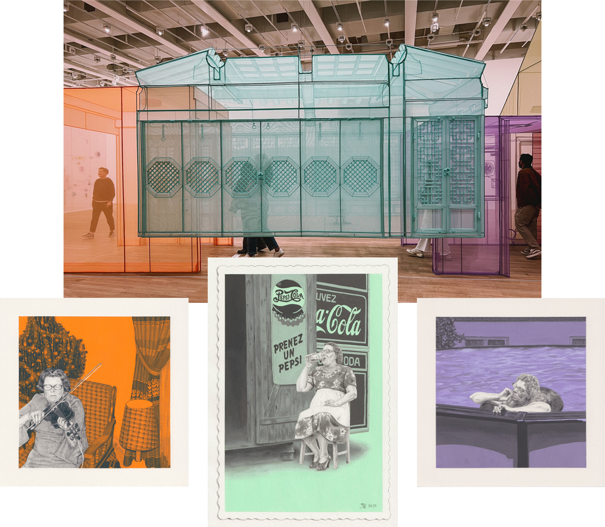
Do you remember two newsletters back, when I mentioned being somewhat inspired by an installation from Do Ho Suh for the colour palette? ‘Course you do. But here’s a reminder just in case:
Once again, I questioned my choices while working on some details. You’d think the plaid pattern on the rocking chair and lampshade would be the worst, but you’d be mistaken! It was the pattern on the curtains. The various tones combined with gradients in the folds were especially hard. Creating a ‘grisaille’ is hard enough, but doing it by mixing grey with a colour instead of white is even harder. Well, it was harder for me anyway. Especially since the gouache colour mixed on the palette changes once it dries!
I enjoyed working on the Christmas tree. Tinsel is extremely bad for the planet, and I wouldn’t want it in my tree nowadays anyway, but I sure love the retro look of it. When going through my mum’s photo albums I found a few cool trees. Like this one from 1959, with all the gifts under it:
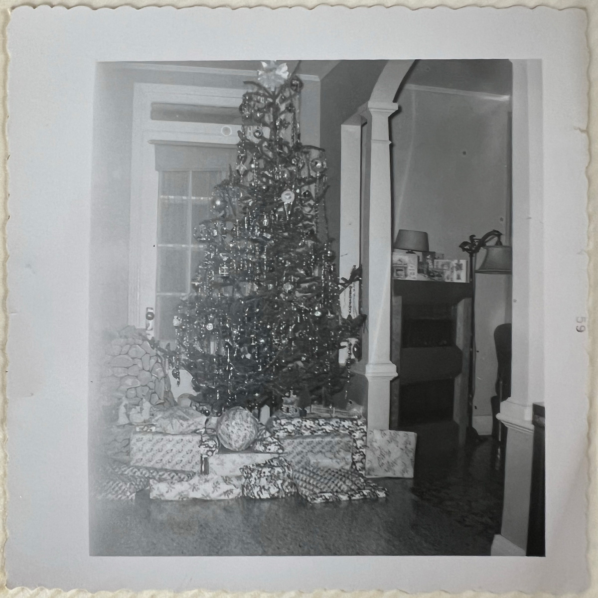
I just noticed the nativity scene to the left of the image, with a rocky patterned fabric background. Had the picture been ever so slightly clearer, I would definitely have used it as a reference photo for a drawing.
You know what, I didn’t plan this post to be so Christmas-related, but I’m rolling with it. Let’s enjoy this photo that does the Instagram rounds every year during the yuletide season, and yet I’m not tired of seeing it:
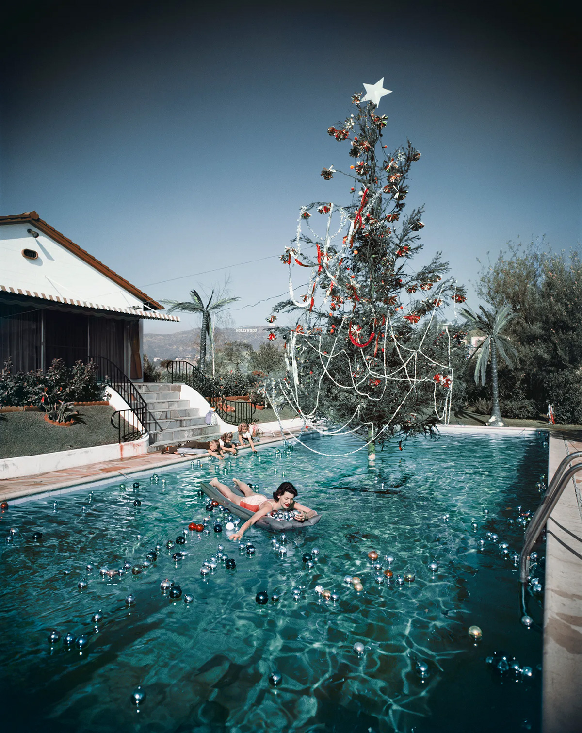
Christmas Swim, 1954, by Slim Aarons
The colours are so great! It’s so fun with the baubles everywhere in the pool! I’m not usually a big fan of palm trees and hot weather at Christmas—I’m from Québec after all—but this image feels very Christmassy in spite of it all. There’s some magic to it.
And on that note, it’s a wrap on Inspired for 2025. You’ll find me in your inbox again in 2026 (let’s take a moment to be incredulous together at how quickly this year went by!).
Until then, take care and I hope the holiday season will be kind to you.
Judith xx
Reference photo, which I cropped for better composition
Close-ups
Monthly inspiration
I recently visited some beautiful churches in London, and I thought it’d be fitting to talk about them in this newsletter. After all, the only time I went to church as a child was at Midnight Mass, on Christmas Eve.
I’m not a religious person, but I like beauty. And a lot of churches are stunning. Some feel very peaceful too. You don’t have to be a believer to feel calmer within their walls.
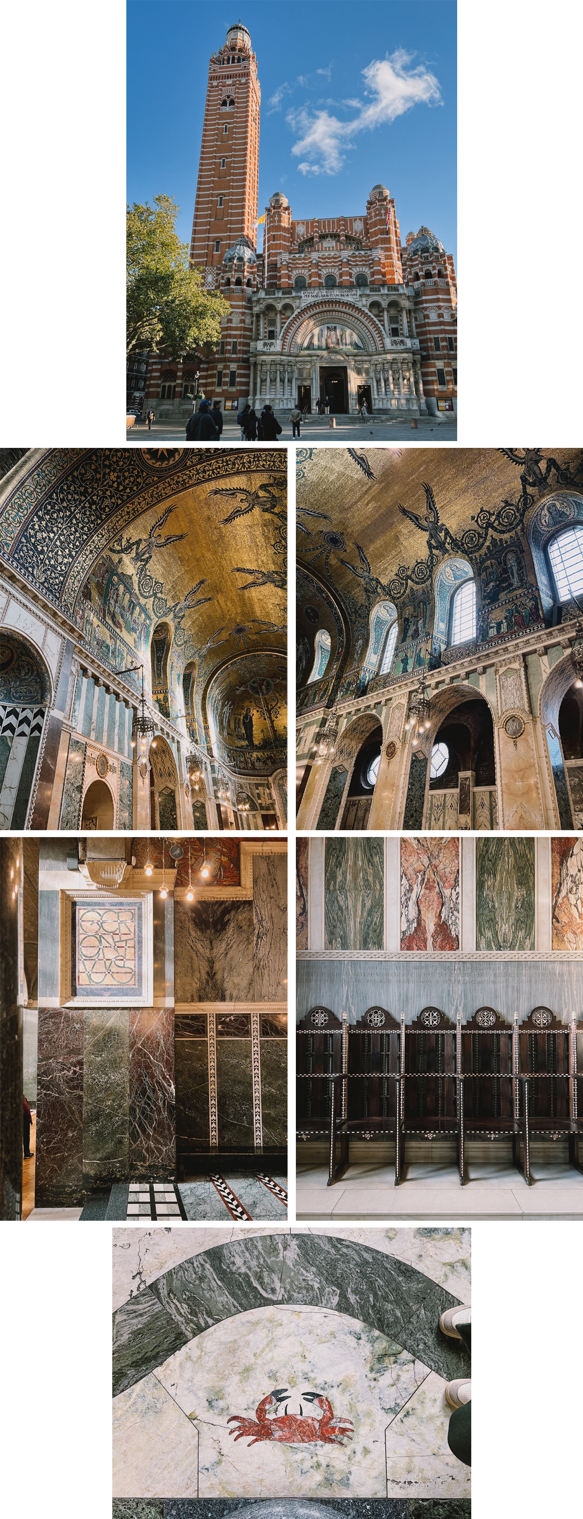
I was reminded of Venice’s Basilica di San Marco upon entering Westminster Cathedral, with all the golden mosaic. This 1903 church has the particularity of not being finished inside: most of the ceiling is just exposed black bricks. It makes for an amazing contrast with the parts that are ornately decorated.
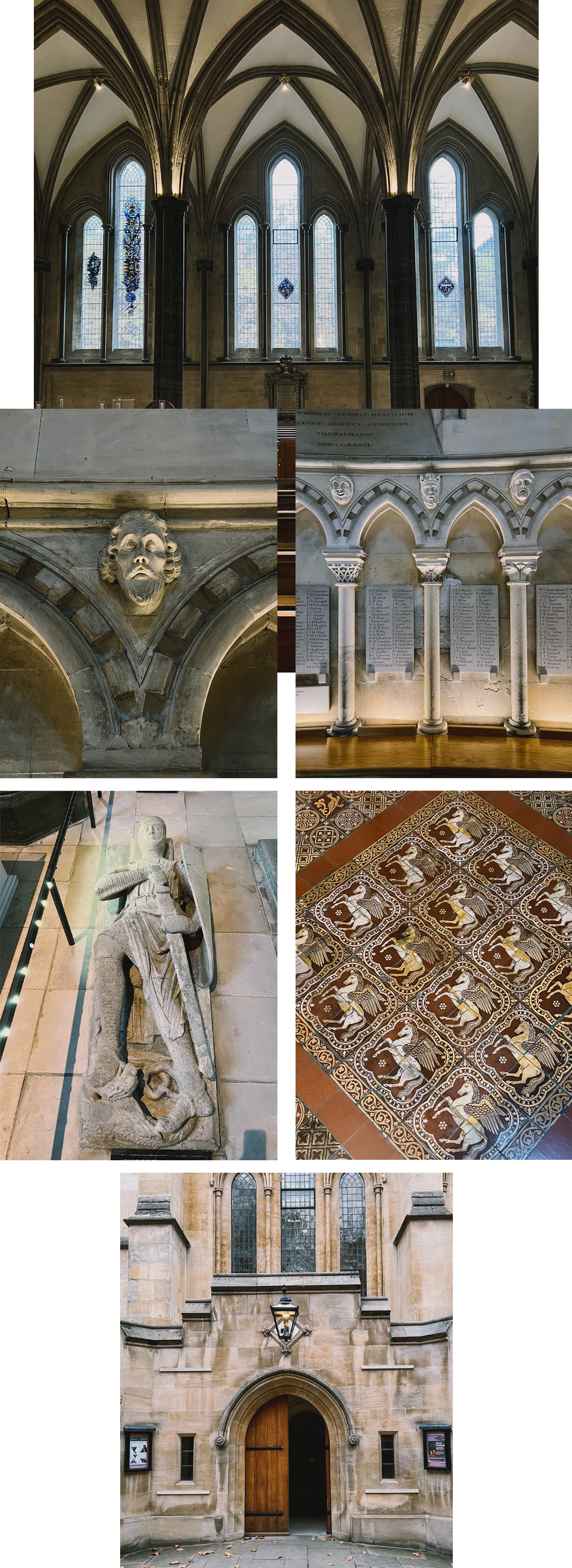
The Temple Church, built by the Knights Templar in the 12th century, was less grandiose but full of great details. I loved the circle of portrait heads all around, known as ‘The Grotesques.’ They’re stone effigies of knights, just like the memorial sculptures found on the floor.
The tiles covering the floor at the top of the stairs had great designs. I especially liked Pegasus.
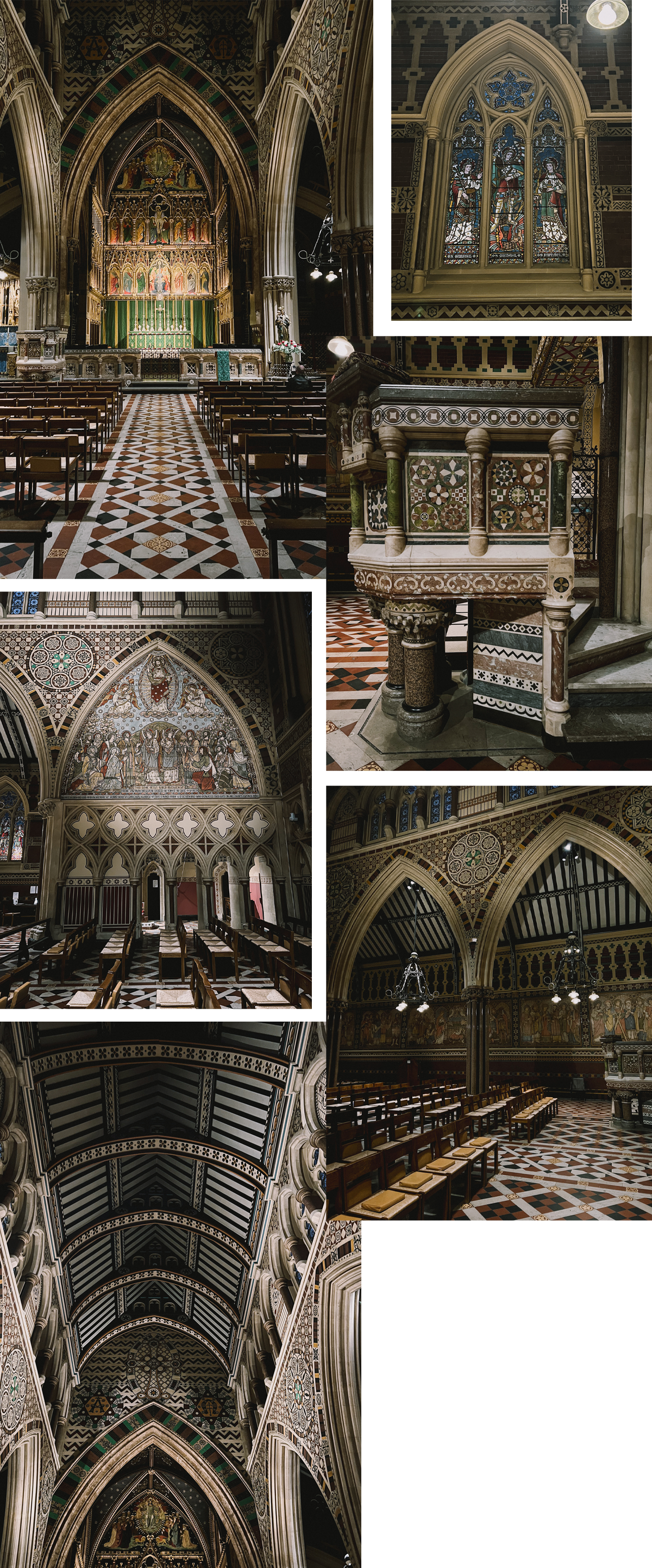 All Saints, Margaret Street, was richly decorated from floor to ceiling and I loved it! Designed in 1850, it is regarded as one of the foremost examples of High Victorian Gothic architecture in Britain.
Want to get this blog directly in your inbox each month? Just subscribe to my Inspired Substack.
Dolores, A Short Story
October 28, 2025
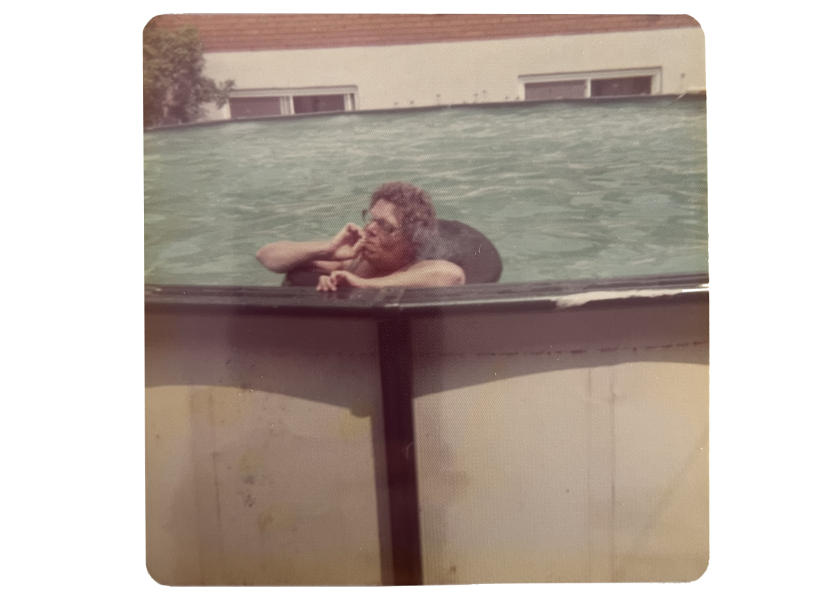
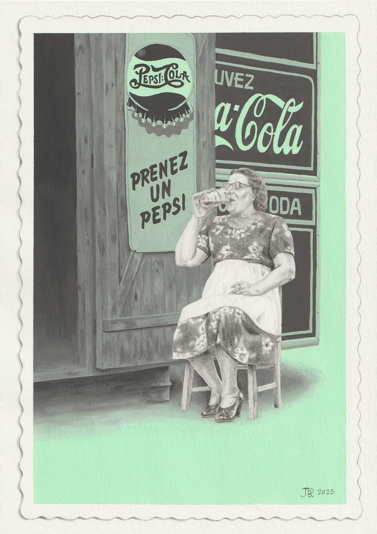
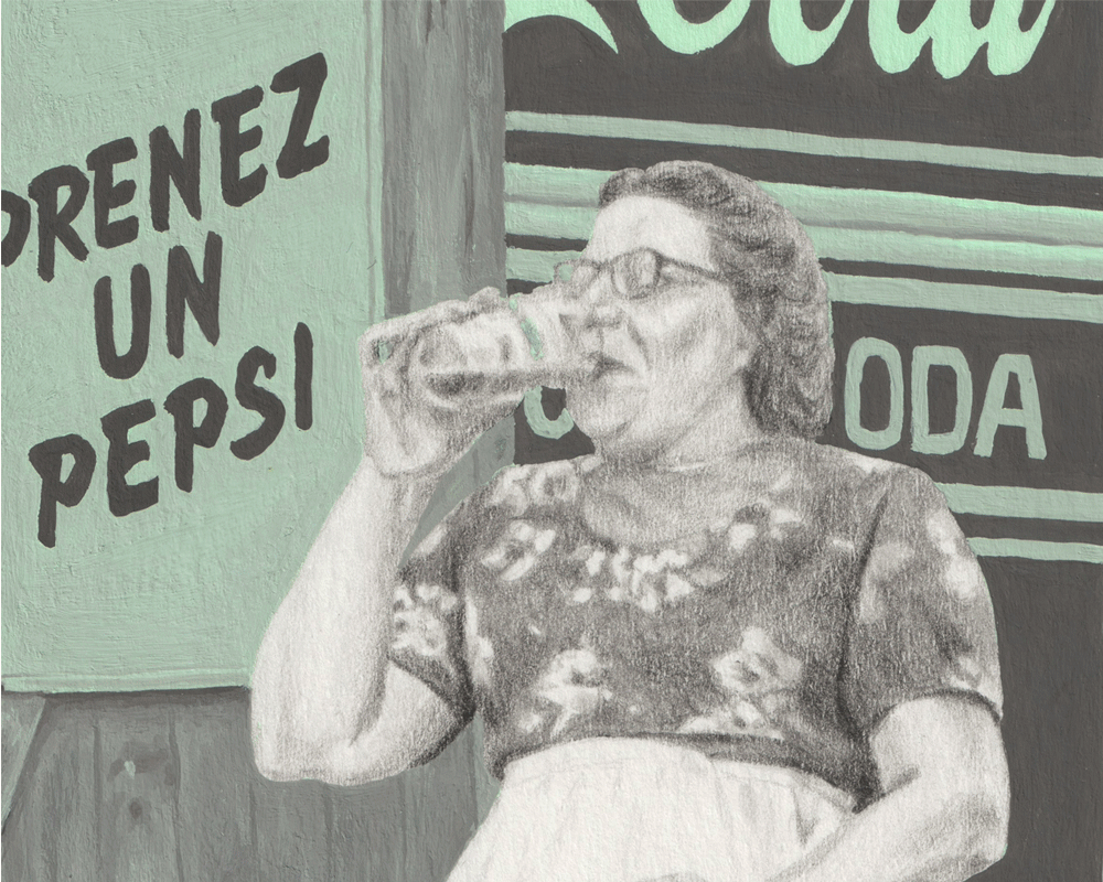
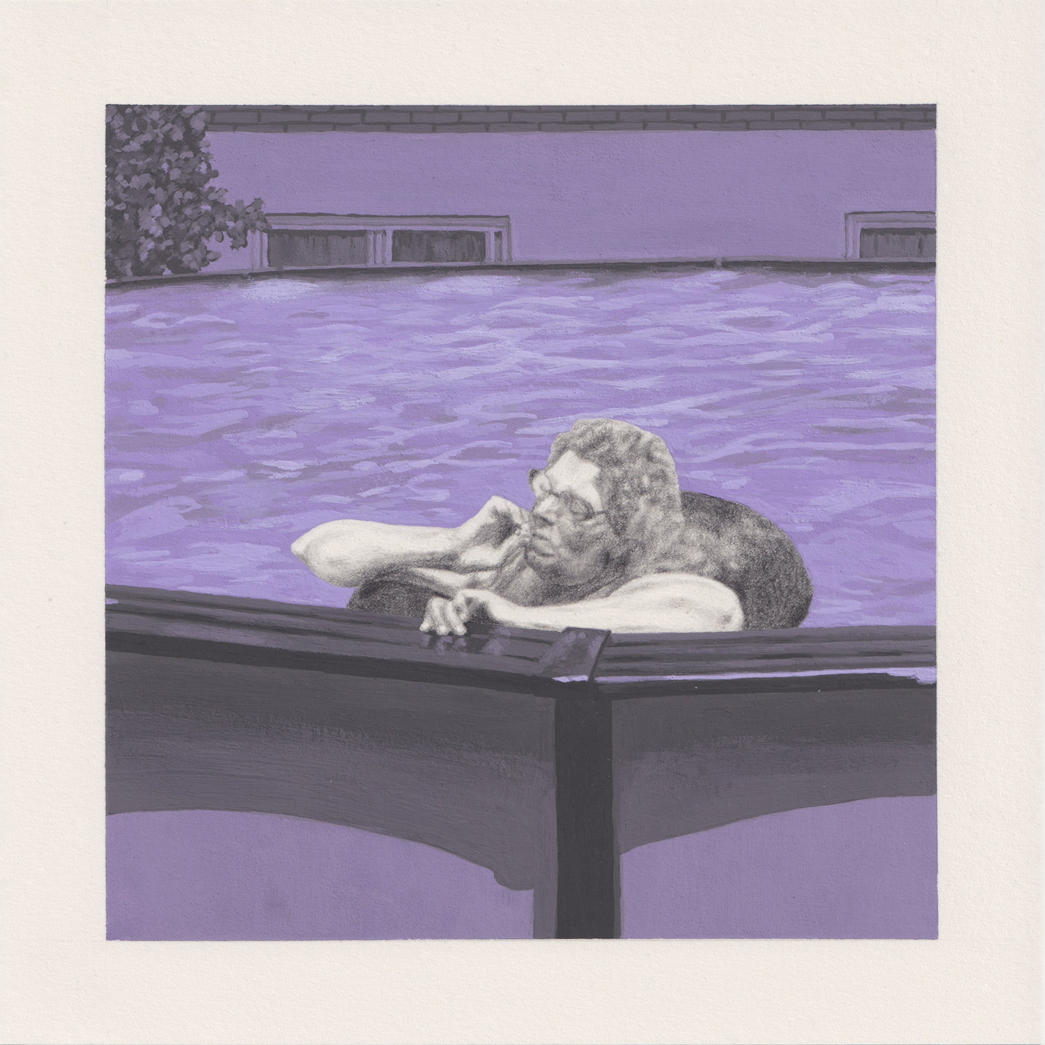 La Piscine, 2025. Graphite pencil and acrylic gouache on paper
Dolores—or Dolo, as she liked to be called because she hated her name—was absent-mindedly paddling around in the swimming pool. Floating around would probably be the more appropriate term, as she had a big tyre inner tube circling her, supporting her body.
She was thinking about what she’d cook for dinner. One of their three boarders had left last month, and Roland—her oldest child—had recently moved out. She was still readjusting to the number of mouths to feed: eight in total. That’s if none of her other children were bringing any last-minute guests.
She wasn’t relishing the idea that she’d soon have to go back inside and spend a couple of hours next to the oven, in this baking heat. But it was Sunday, the house was full, and someone had to cook for them lot. She’d never admit it to anyone, much less to herself, but she enjoyed seeing them devour the meals she’d carefully (some might say lovingly) spent so much time preparing.
Dolo took one last, long drag on her cigarette, slowly exhaled, and made her way out of the pool.
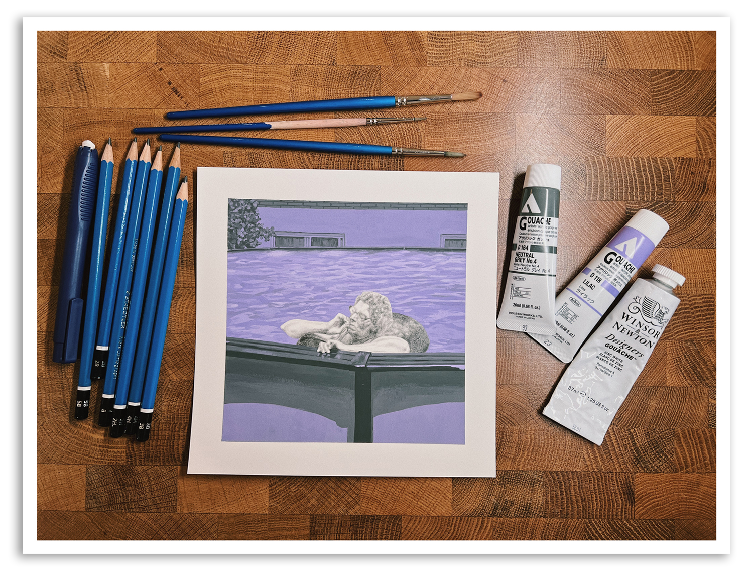
All the material I used
Since the process for this piece was similar to last month’s, I thought this time it’d be interesting to tell you a little story about my grandmother instead. It’s all based on snippets of information I learnt about her. It was fun to imagine what could have been going through her head when the photo was taken.
Although I had some sort of story in my head for each of my ‘Friendship’ series paintings, to help me to create the scenes, I never wrote anything down. But maybe I should start writing short tales like the one above to go along with my pieces? Only for myself, so it stimulates me while drawing and connects me to a deeper meaning. Something to think about!
Judith xx
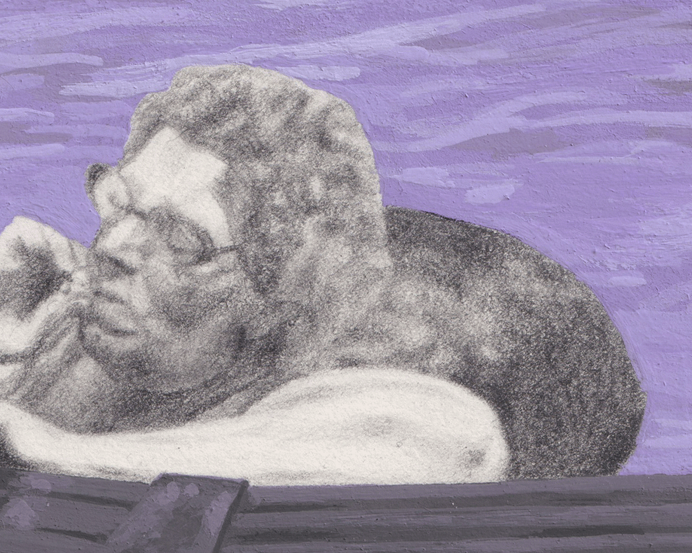
Close-ups
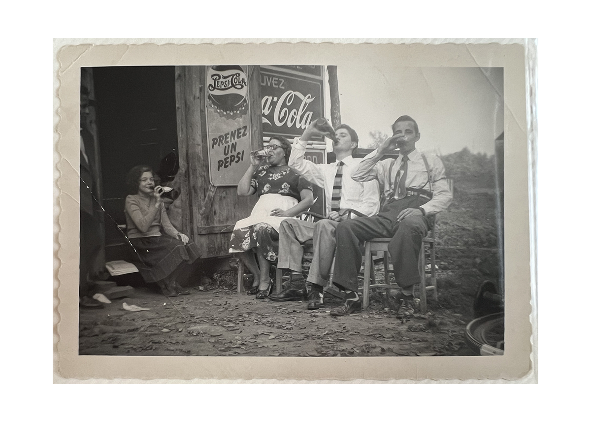
![]() Reference photo, which I cropped (and straightened) for a better composition
Reference photo, which I cropped (and straightened) for a better composition
 Reference photo, which I cropped (and straightened) for a better composition
Cheeky exhibition announcement
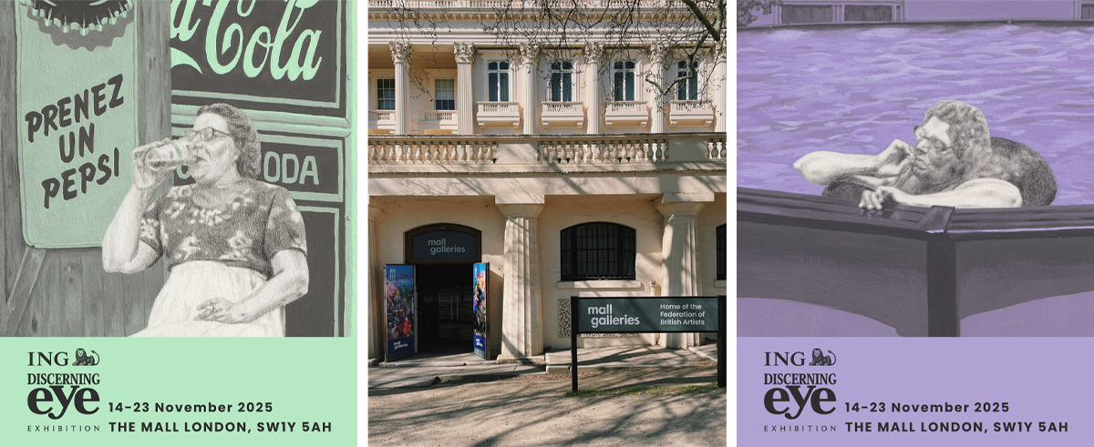
If you’re in London and would like to see both this artwork and the one from my last newsletter in real life, you’re in luck! Or rather I’m the lucky one, because both pieces have been selected by ING Discerning Eye to be exhibited at the Mall Galleries.
Running from 14 to 23 November, the free (!) exhibition will showcase 735 works by 529 artists in a wide range of media.
Monthly inspiration
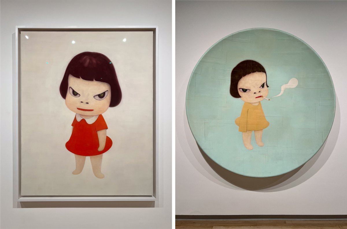
You won’t be shocked to learn that I’ve seen many exhibitions recently, so choosing one for inspiration was hard. I’m going with the artist Yoshitomo Nara, whose retrospective I saw at the Hayward Gallery, because I love to be happily surprised.
I wasn’t attracted to his work based on the few images I’d seen of it. I like Japanese animes, but I didn’t think the manga aesthetic of Nara’s work was interesting as works of art. They looked too flat to me. I was very wrong!! Never under-estimate how bad photos are at showing you all the subtleties of art.
Look at these close-ups. Look how many colours and shades can be found in the faces.
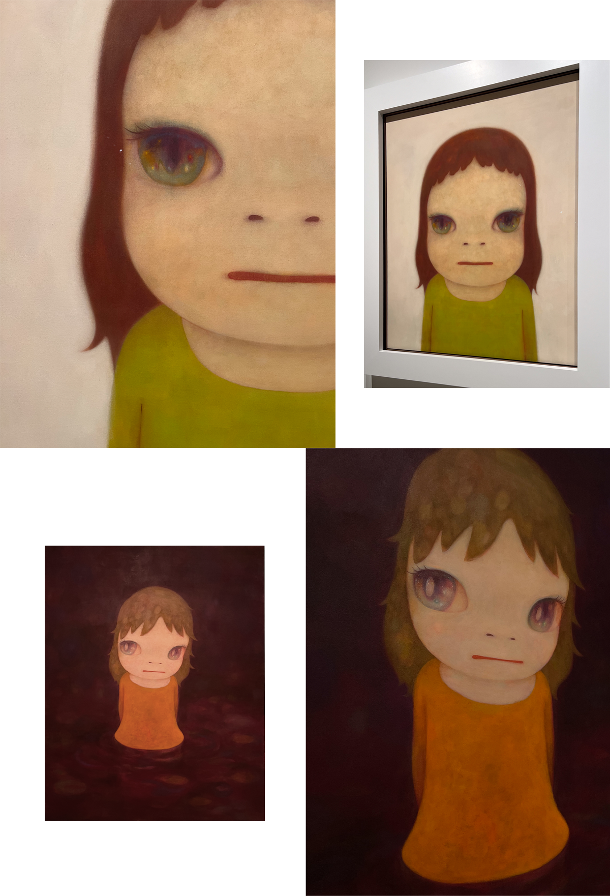
In a way though, I think I preferred his drawings to his paintings. They were joyful and so inspiring in their reminder that you can draw on anything. You don’t need “good” material to do art—unless you’re doing watercolour, that ruthless medium! You can just grab anything and have fun with it.
I always welcome a reminder to play.
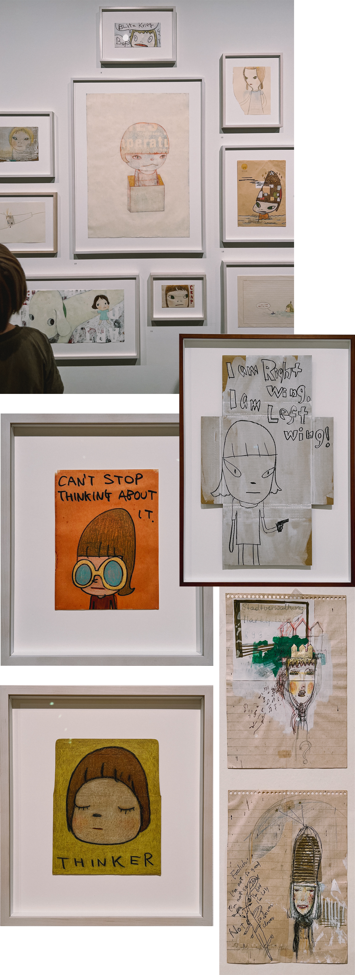
Some drawings by Yoshitomo Nara
Want to get this blog directly in your inbox each month? Just subscribe to my Inspired Substack.
Can You Know Someone From A Photo?
August 26, 2025
I never knew my maternal grandmother, she died years before I was born. All I know about her are the few stories I got from my mum and my aunt. Which might be why I'm fascinated by pictures of her, trying to piece together who she was.
 La Roulotte, 2025
Some of you might remember that in 2022 I drew my grandmother as a young woman, playing the mandolin. I thought it’d be nice to turn it into a series.
Series are great because they make it easier to know what to do next. It removes part of the decision-making process and potential creative block. You can build on what was done before instead of thinking about everything from scratch.
In this instance, I knew I wanted to use graphite pencils and paint the background a bright colour like on the first portrait. But instead of a solid colour this time, I wanted details in the background. So I chose a grey— somewhat replicating the colour of graphite—to mix with the pop colour.
I went with acrylic gouache, seeing as I’m now more familiar with gouache. Applying the first layer of mint green went well. It’s when I tried to do gradient and to blend the colours on paper that I realised something wasn’t quite right. The paint was drying in two seconds and it couldn’t be re-activated with water. It kept telling me “dude, I’m clearly acting like acrylic paint”, to which I would reply “no, you’re gouache and you’re going to behave like it!” Guess who won?
Once I started treating it like acrylic, I was able to (mostly) do what I wanted with the paint.
Reference photo
In the image my grandmother is sat in front of the food trailer my grandparents used to operate on weekends, to make ends meet. A fact I only learnt about when I showed my mum the reference photo. There are still so many things I don’t know about my grandmother. I’ll keep looking for clues in photos of her.
Judith xx
Close-ups
Monthly inspiration
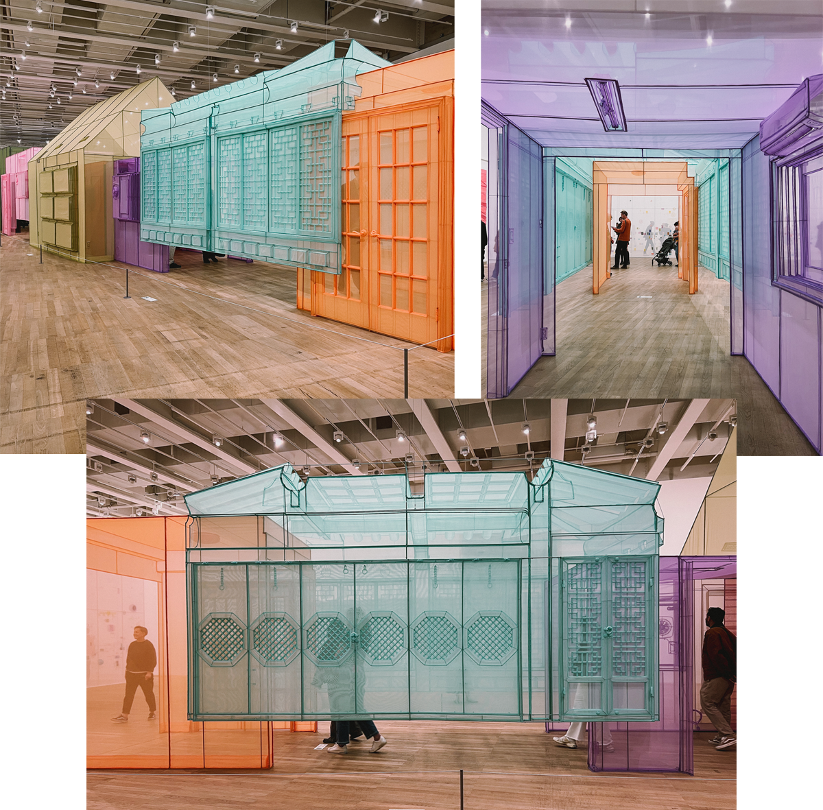
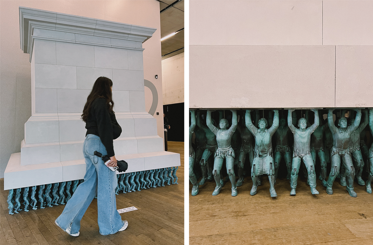
The Korean-born, London-based artist Do Ho Suh’s work explores the idea of what ‘home’ is. His large-scale installations are breath-taking by the mastery and time that went into them.
One of his pieces inspired the colour of the fourth and final drawing I will be doing in my series. This is all made from fabric:
You’ll see next month which colour I used for the third drawing
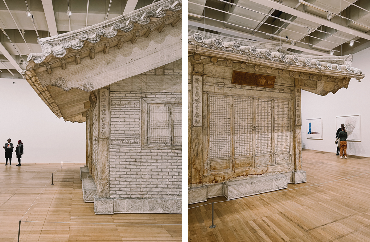
The below was made by covering an actual house in paper, rubbing graphite on it, then removing the paper and reconstructing the house with it!
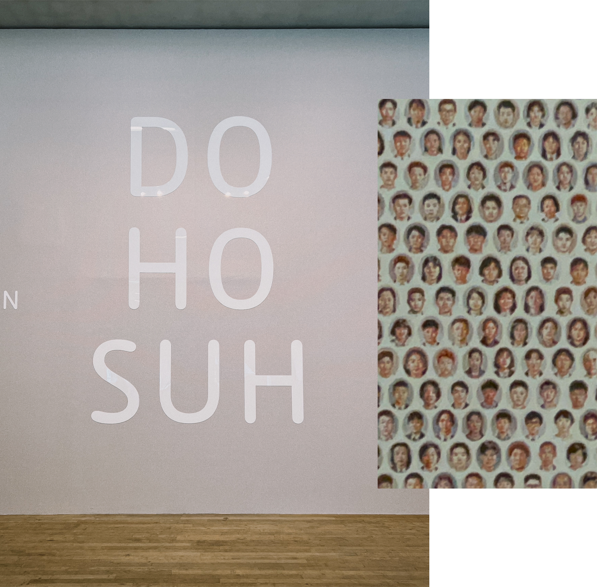
The same wallpaper ran throughout the exhibition. From far it looked like tiny dots, but up-close you realised they were actually portraits of people:
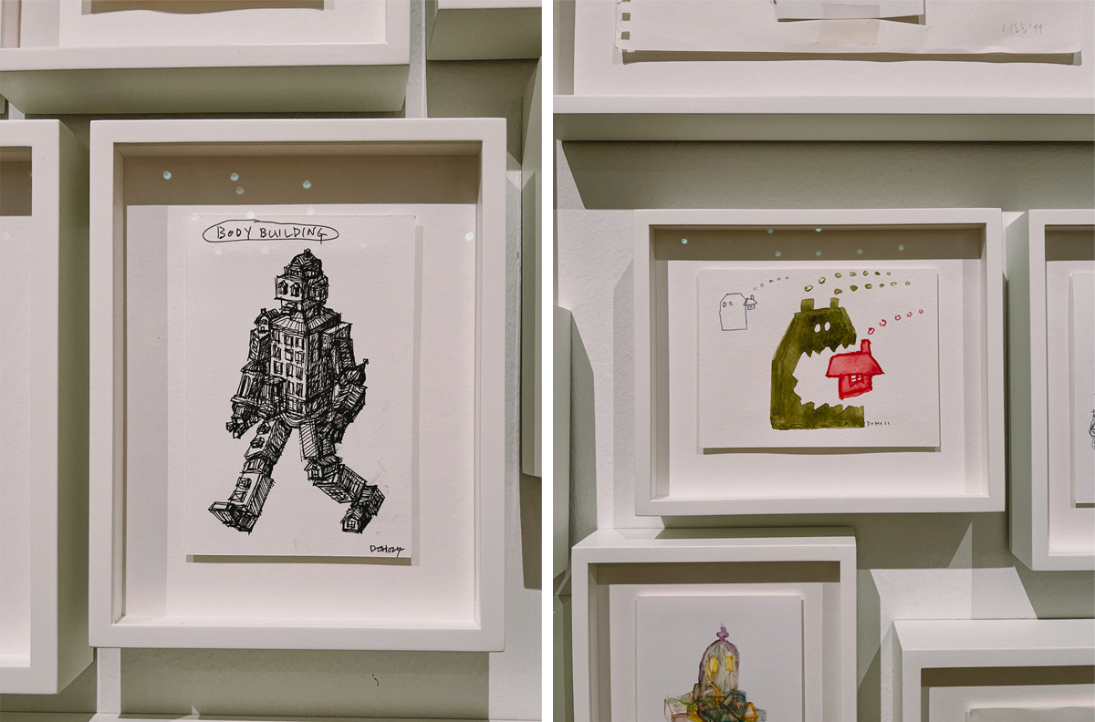
I really liked his illustrations:
This plinth was transported into the museum by the ‘people’ underneath it:
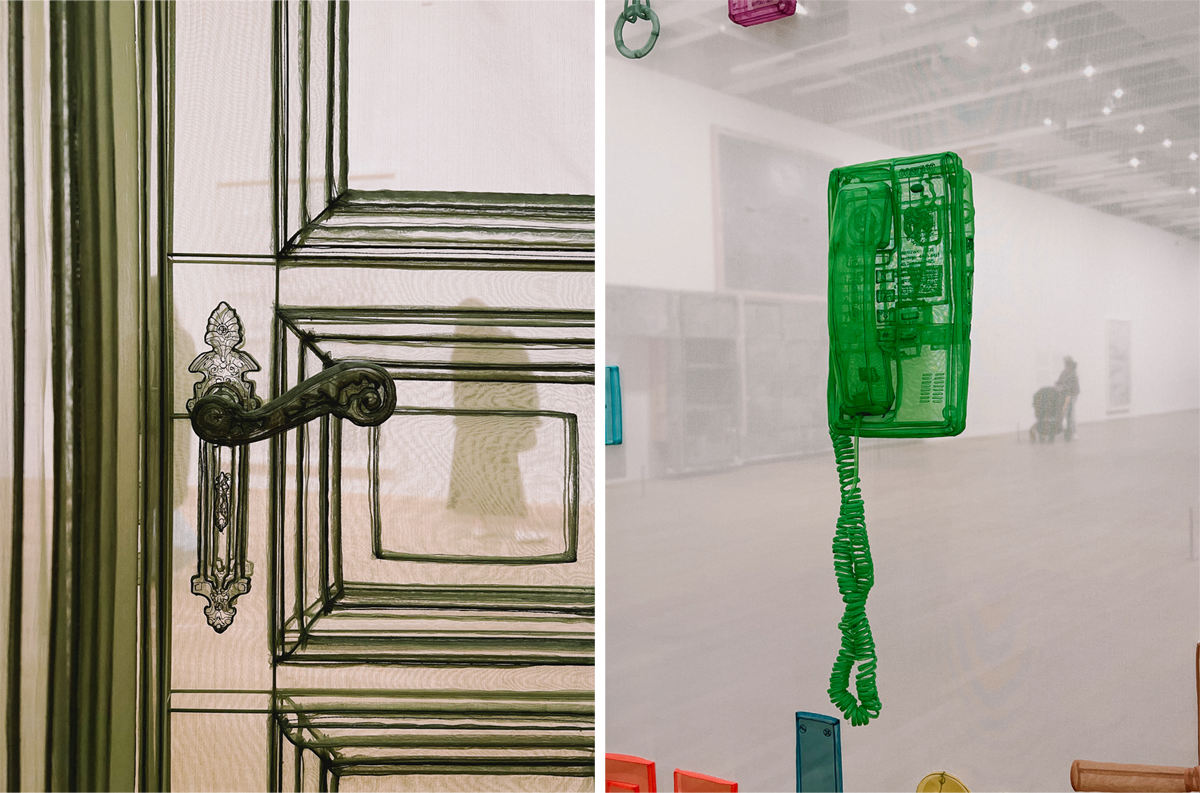
I’ll leave you on these lovely details, made of fabric and thread:
Want to get this blog directly in your inbox each month? Just subscribe to my Inspired Substack.
How Dare You – Part 3
June 24, 2025
If you missed the previous parts and want to read them first, just click on the links:
Part 1 Part 2
"If things are as you say, I will allow you to take as much rapunzel as you want. But under one condition: You must give me the child that your wife will bring to the world. It will do well, and I will take care of it like a mother."
—The Witch
—The Witch

Now why would the Witch make such an extreme demand?
That’s one of the questions I asked myself to figure out her background story, so I could understand her character.
Based on her own words, she wants to care for the child like a mother. Did she miss her window of opportunity to conceive, through lack of good suitors? Could she not bear a child? It makes her character more complex and interesting to think she wants the baby out of desperation rather than malice.
How does this inform her visual representation you ask? I’d like to think that believing that she’s not evil helped me convey a certain softness.
Witches in fairy tales are often ugly, though sometimes as beautiful as they are malevolent. I wanted the Witch to be neither ugly nor beautiful because I didn’t want her physical appearance to be a point of discussion. It’s totally irrelevant to the story whether she’s attractive or not.
She does have a very pretty dress on though! Should she be wearing a plainer frock based on her social status? Probably. Then again, she might be a single woman of means, owning a lucrative business selling potions and lotions. Or something.
I was inspired by dresses from a few sources, but the main ones where these two tapestries:

Close-ups on some tapestries I shared in Part 2
As for the Husband, I made him a merchant. Mainly so I could treat myself by drawing some more nice clothes.

In hindsight, although he wasn’t the intended inspiration, the Husband reminds me of Prince Humperdinck in The Princess Bride 😳

Prince Humperdinck
I purposefully made him look a bit old for a first-time father, since the tale starts with “Once upon a time there was a man and a woman who had long, but to no avail, wished for a child.”
The Husband’s pose changed slightly after I sent the first sketch to my brother, who had notes… To be fair to him, he’s an animator, so body language and ‘action lines’ are his area of expertise. He very sweetly sent me a few reference photos of himself acting as the Husband, for me to copy his pose. I created a mix of his pose and the one I’d already done.
 Rough sketch, after I sent it to my brother as you can see I started figuring out how I would change the position of one of the legs
This concludes the process for my Folio Book Illustration Award entry!
I’m sorry to say I didn’t make it to the longlist. I was briefly disappointed, but this text message from a friend who also entered the competition cheered me up:

The Folio longlist came out!! They forgot to include us, weird
Judith xx
Monthly inspiration

O’Donoghue and I share some traits: she laughs and cries easily, she sometimes snorts when she laughs, and when she finds something that someone said funny, she repeats it in a higher pitched voice. And I must not hate those traits in myself, because I very much enjoy listening to her!
There’s currently a sub-theme to the podcast: Magical Garbage. It covers a lot of very good fantasy movies that shaped us as kids/teenagers, including one I mentioned above: The Princess Bride.
Some other films I very much enjoyed revisiting with O'Donoghue and her guests’ clever analysis are: Shrek, The Lord of The Rings, and Labyrinth.
I am, obviously, LOVING this series.

Want to get this blog directly in your inbox each month? Just subscribe to my Inspired Substack.
How Dare You – Part 2
June 24, 2025
It’s time for a full reveal of my Folio Book Illustration Award 2025 submission:

Ta-da!
By the way I still don’t know if I’ve been longlisted or not. I’m not even sure when I’m supposed to hear back. I don’t really have high hopes if I’m honest. Which is not to say I’m not happy with what I created, I am. But last time I participated the quality level of the longlist selection was extremely high. If it’s the same this year, I don’t think I stand much of a chance. That’s okay though, it gave me the motivation to try something new and have fun with it.
If you missed last month’s post, you can read it here. This month I’m breaking down the inspiration behind the border of the illustration, which is really just an excuse to talk about my love of tapestries.
Esther approaching Ahasuerus tapestry (made 1500-1525) can be seen at the V&A Museum
I wanted a frame around the illustration because a) I like a frame and b) I wanted to use it for storytelling. Parallel to this, I had late medieval Europe/early Renaissance era (1300 to 1500 AD) in mind for what the characters would be wearing. So, when I came across images of tapestries spanning that period, I had found my inspiration!
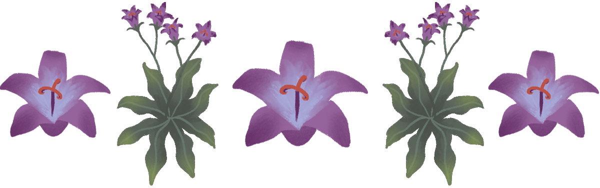
I did a lot of research to find references for the illustration. Like, A LOT. About five hours total, to find the right clothes for the time, the right house, the right flowers and plants. Oh, and what ‘rampion (or rapunzel)’ actually is/looks like. So, the flower you see at each corner is, to the best of my googling abilities, a rapunzel flower. As are the plants on either vertical side of the frame.
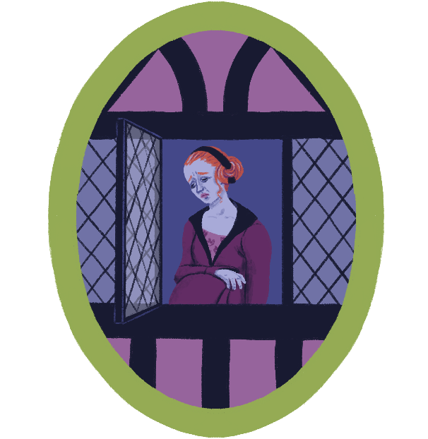
The pregnant lady in the oval at the top is the Wife—let’s remember the characters are never named in the story, except Rapunzel. The Wife, as I was saying, is looking longingly at the rampions because she’s got a craving for them. A craving so bad she will let herself die if she can’t eat the damn plant. Which is why the Husband ends up trying to steal rampions from the Witch’s garden.
I still can’t believe I spent ages looking for the right image of a half-timbered frame houses, only to show next to nothing of it in my illustration.

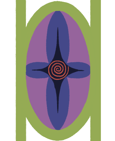
Now I only had to find something to put inside the ovals on the left and right borders. For reasons I’ll go into in Part 3, involving part of the plot and a whole backstory I created for the Witch, I wanted to include a fertility symbol. After more research, yet again, I went for this spiral. Though I’m still not 100% sure I trust my internet sources on its authenticity.
Finally, just for fun and to break the rigidity of the frame, I let the Witch’s arm overlap with it. She is magical after all, so she probably has the power to step outside of her world.
Tune in next month, for the final part of my process. I might also know the longlist results by then!
Judith xx
Monthly inspiration
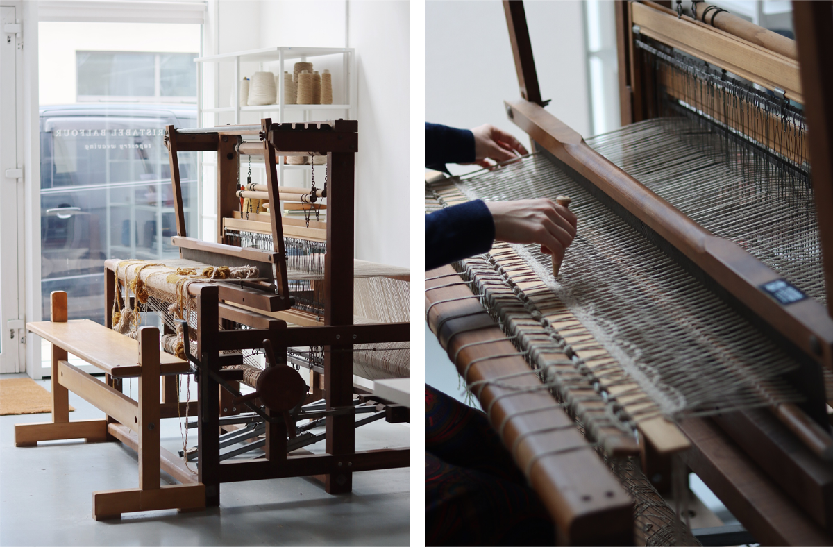
For people who don’t know much about textiles, tapestry is a type of weaving done on various types of loom.There are also different types of tapestries, but I’ll just mention wall hangings. They are bigger and more impressive. I’m in awe of the skills and patience it takes to make them!
 Floor loom images by
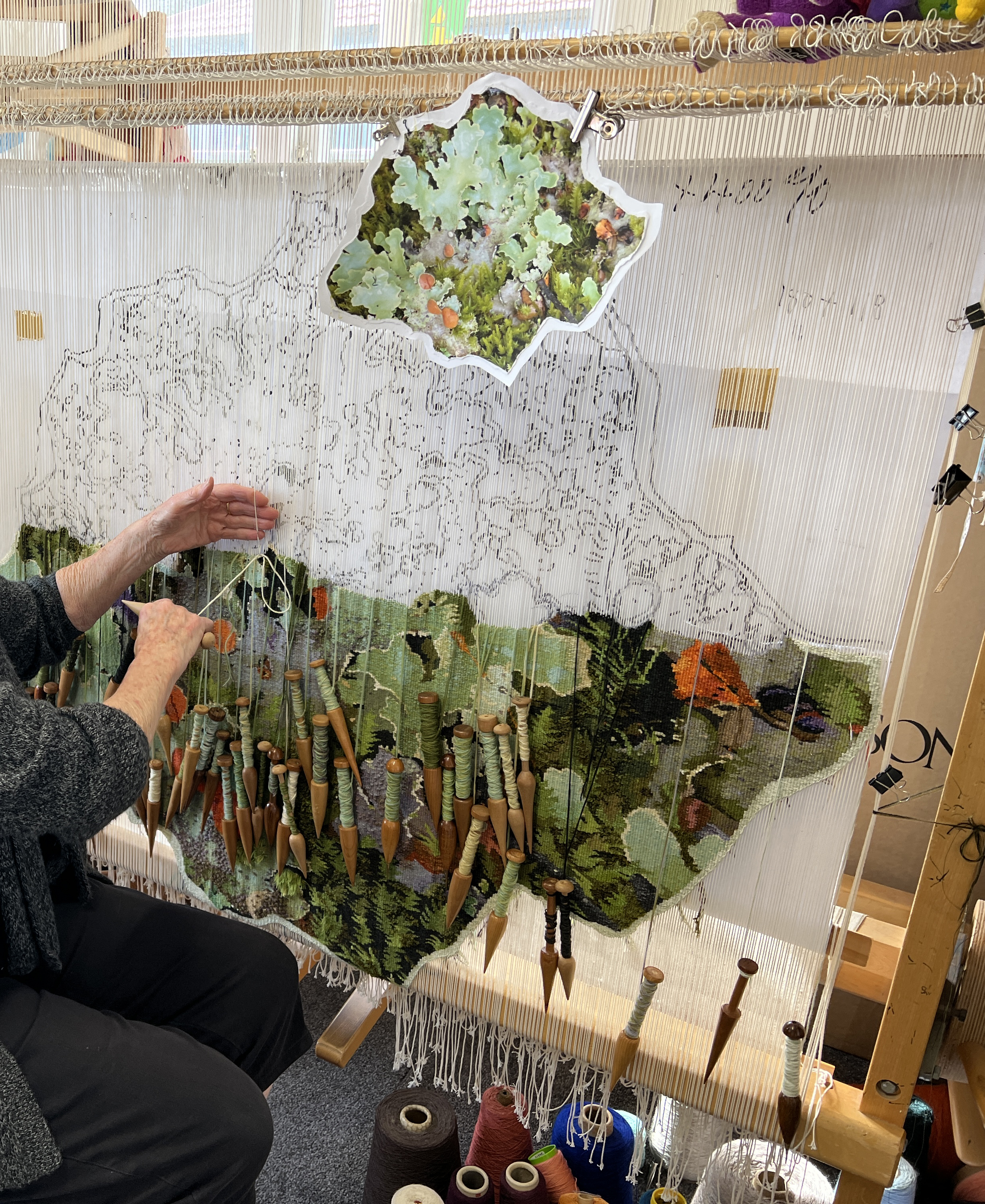
This photo is from the Wikipedia entry for tapestry. LOOK AT HOW MANY THREADS ARE NEEDED! It must take ages to create.
I won’t show you all the tapestries I love, because there are too many of them. Let’s just look at these three from the series The Lady and the Unicorn (French: La Dame à la licorne). They were created in the style of mille-fleurs (“thousand flowers”) and woven in Flanders from wool and silk, from designs (“cartoons”) drawn in Paris around 1500. The set is on display in the Musée de Cluny in Paris.
Five of the tapestries are commonly interpreted as depicting the five senses—taste, hearing, sight, smell, and touch. The sixth displays the words “À Mon Seul Désir”, meaning “To My Only Desire.” It alludes to courtly love, a medieval European literary conception of love that emphasised nobility and chivalry.
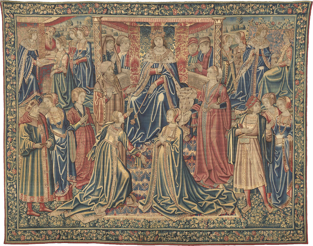
Below are Hearing, À mon seul désir and Touch. The details are stunning, especially in the dresses.
 Hearing, À mon seul désir and Touch tapestries
Want to get this blog directly in your inbox each month? Just subscribe to my Inspired Substack.