
Minoterie Calico Mill
Branding for Calico Mill, a B2B company producing organic corn flour.
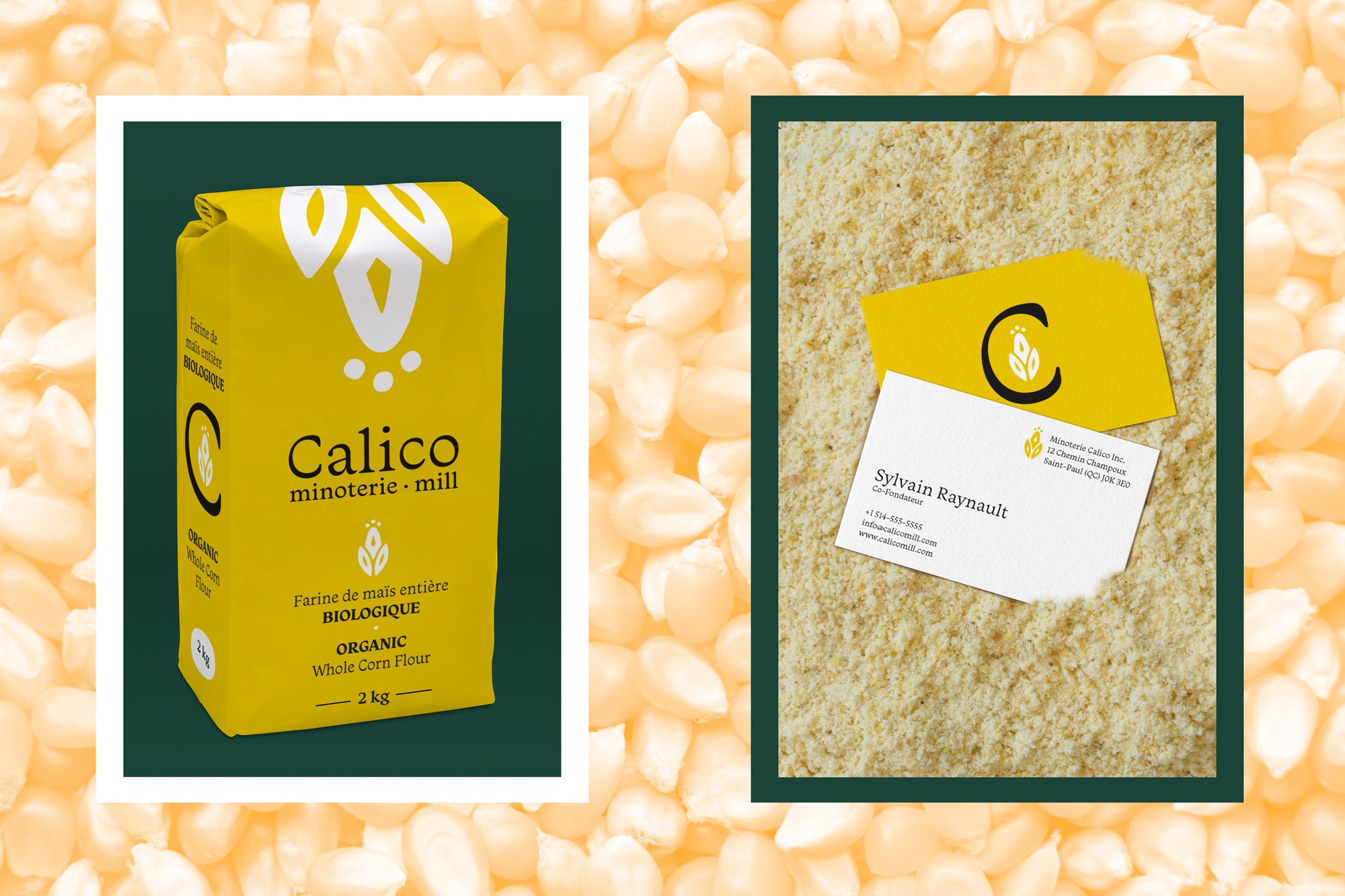
This concept is inspired by the art of Canada’s First Nations at the time of the arrival of the colonisers. They cultivated corn and would collect them in baskets decorated with patterns made with stamps cut out of potatoes.
The humanist font was chosen to match the stamp's organic shape. The roundness makes it friendly and organic, characteristics associated with organic products.
Role: Art direction, Graphic design
Client: Minoterie Calico Mill
Field: Branding & identity
Year: 2022
Process
Exploration
First logo options
2nd logo options