Dire magazine
Mock-up presented to the University of Montréal for the rebranding of Dire magazine, a popular science magazine allowing graduate students from the University to publish an article resulting from their research.
I introduced the new colors and font used on the rebranded website and posters. The cover is minimalist and the image, while remaining serious, is a little more accessible to demonstrate the magazine is meant to appeal to anybody, not just scholars.
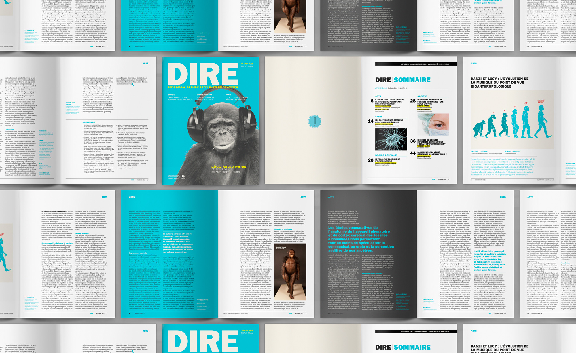
The inside layout is simpler, with only two columns of text per page (instead of three) and more white space. This gives the text room to breathe and makes the reading more enjoyable. Playing with the page and text colour, I wanted to make the reading more dynamic.
Role: Art direction, Graphic design
Client: Université de Montréal
Field: Graphic design, publication
Year: 2014
I introduced the new colors and font used on the rebranded website and posters. The cover is minimalist and the image, while remaining serious, is a little more accessible to demonstrate the magazine is meant to appeal to anybody, not just scholars.
The inside layout is simpler, with only two columns of text per page (instead of three) and more white space. This gives the text room to breathe and makes the reading more enjoyable. Playing with the page and text colour, I wanted to make the reading more dynamic.
Role: Art direction, Graphic design
Client: Université de Montréal
Field: Graphic design, publication
Year: 2014
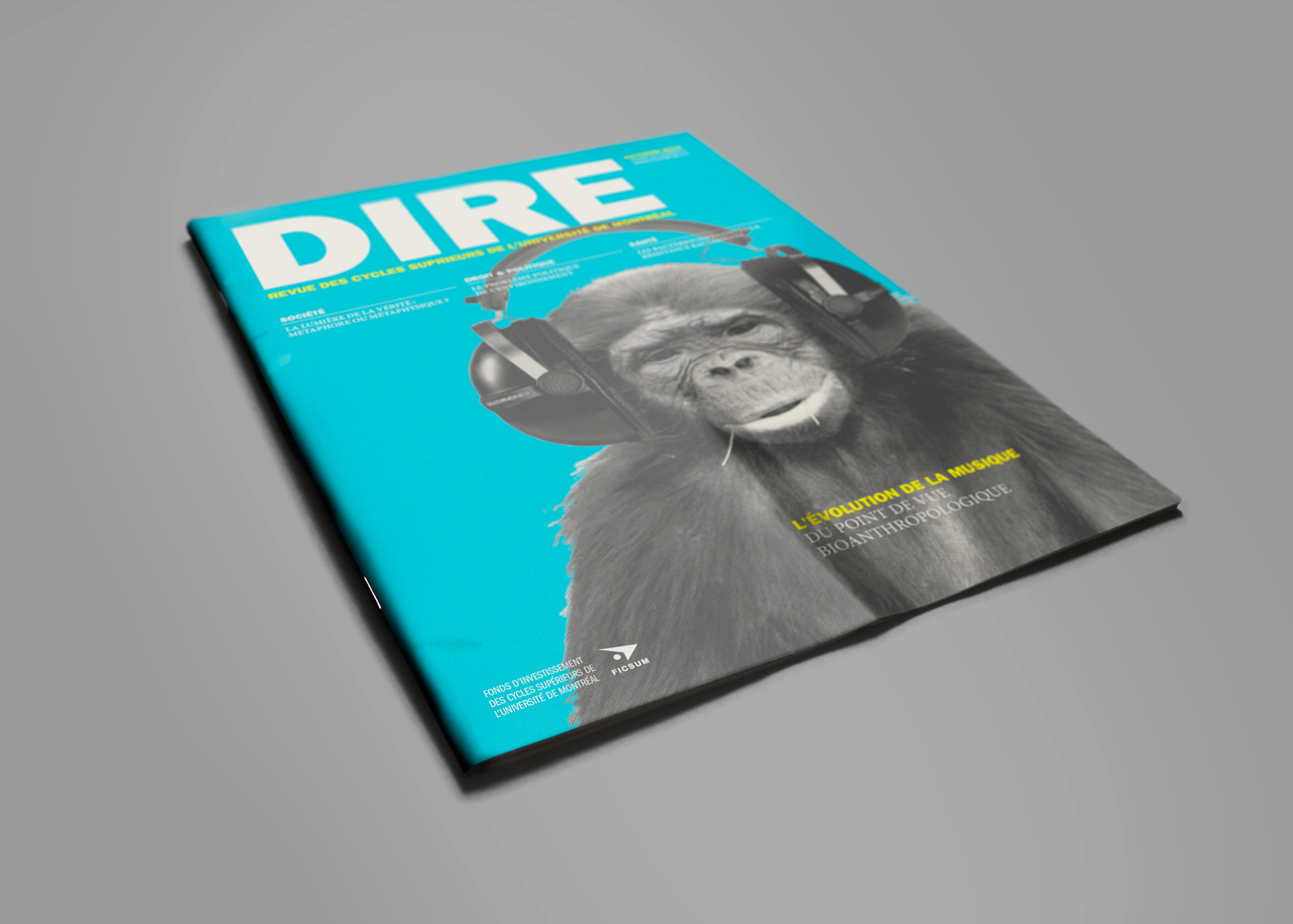

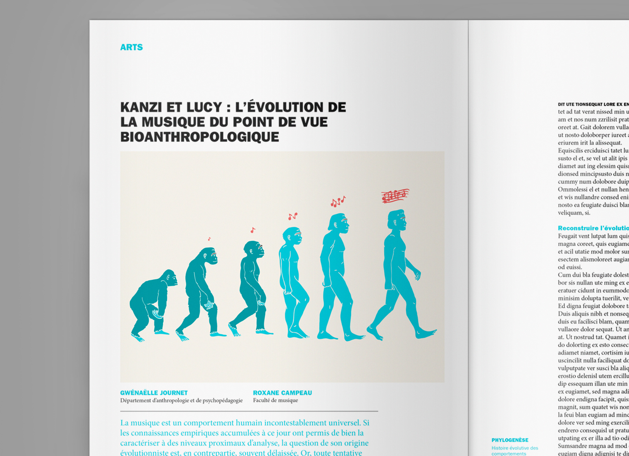
The cover image is related to one of the articles, The Evolution of Music From a Bioanthropological Point of View.
Detail of the illustration I made in relation to the text.