Cecil Taylor
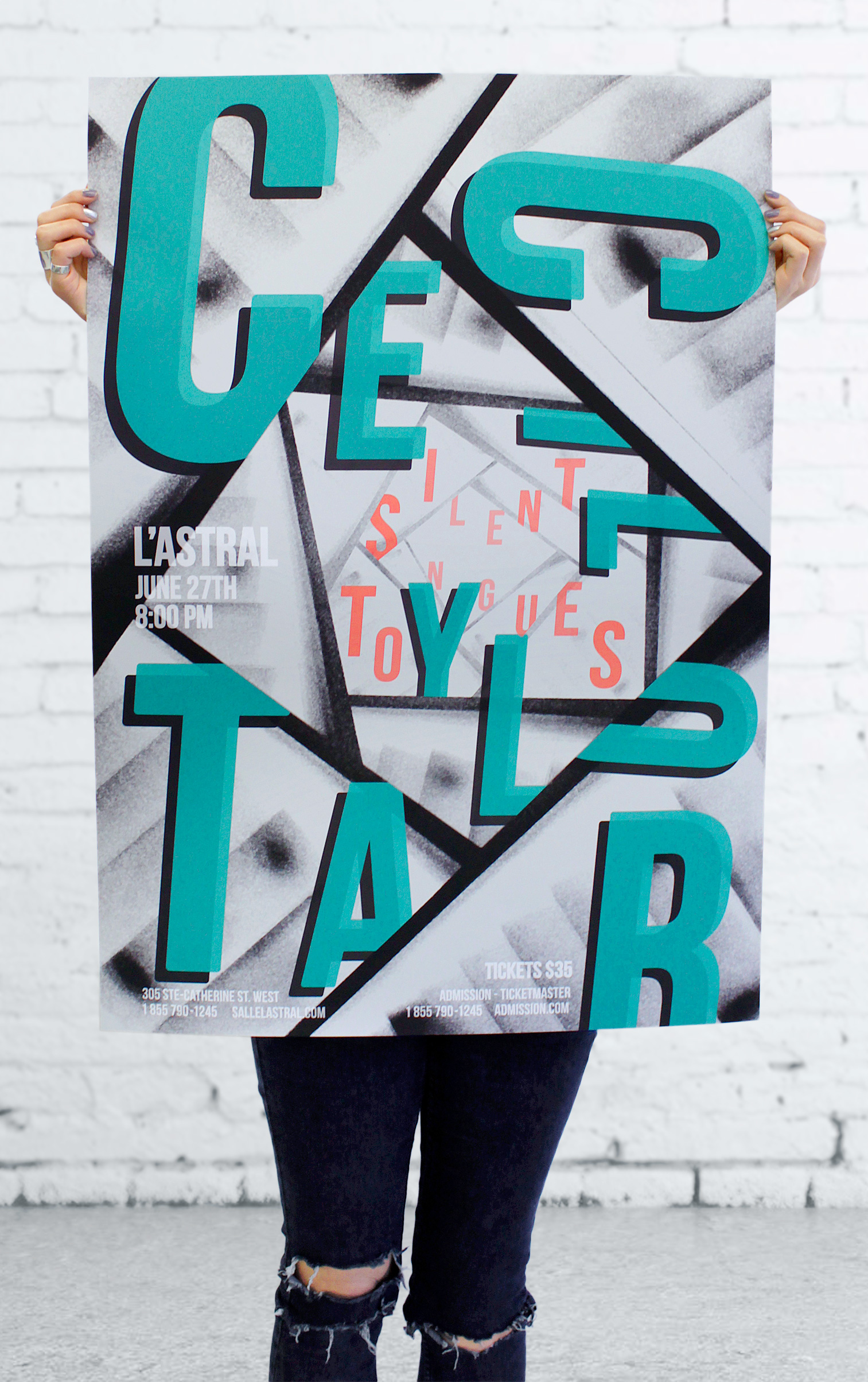
In this poster the name Cecil Taylor takes up most of the space to imitate his music, which has a strong presence. The letters are different sizes to represent improvisation. Though they seem to be placed randomly, you can see a structure behind these letters, which shows Taylor’s control over his music.
The jerky movement of the type is reminiscent of the way his notes don’t continually flow, and the background image evokes how notes seem to fall or go down in “steps” and in depth.
The tones of grey convey music which can be stressful. Still, the stairs are bright, and along with the pop colours of the type, show Taylor’s energy.
Role: Art direction, Graphic design
Client: Personal work
Field: Graphic design, poster
Year: 2014