300 Villages
300 Villages aims at revitalizing 300 villages in Quebec with fewer than 3,000 inhabitants. The company sets up, in partnership with local communities, real estate complexes of 10 affordable rental units of ecological construction with a community room. They also offer high-speed internet to provide access to telehealth services.
In order to preserve heritage buildings, 300 Villages is developing a heating system using computer servers installed in church basements.
Role: Art direction, Graphic design
Client: 300 Villages
Field: Branding & identity
Year: 2021
In order to preserve heritage buildings, 300 Villages is developing a heating system using computer servers installed in church basements.
Role: Art direction, Graphic design
Client: 300 Villages
Field: Branding & identity
Year: 2021
Concept:
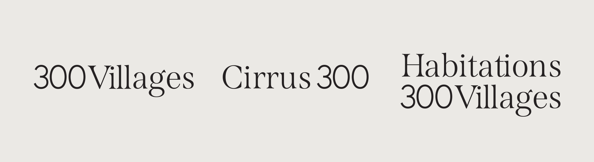
I mixed two different fonts to represent the different aspects of 300 Villages' mission, a combination of warmth and technology. I reworked the serif font to link a few letters together, echoing the links created with and within the communities. In addition, these links add an organic element that recalls the ecological angle.
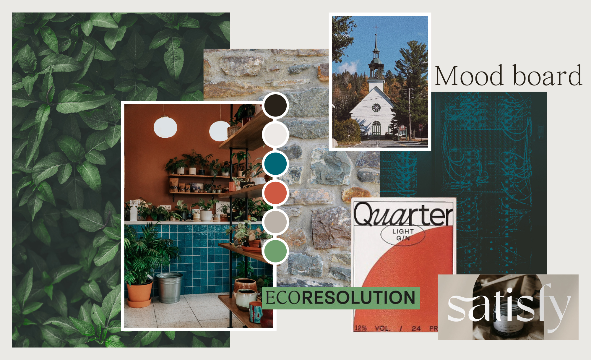
For the color palette, I opted for a mix of warm and cold colors to reinforce the two sides of the mission.
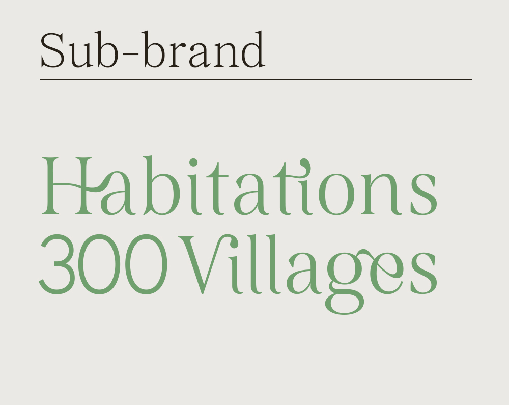
Two brands sit under 300 Villages. I associated blue with Cirrus 300 because it is a cooler color and therefore fits better with the network/computer aspect, and green with Habitations 300 Villages for the ecological aspect. The burnt orange of the main logo is warm and welcoming.
I mixed two different fonts to represent the different aspects of 300 Villages' mission, a combination of warmth and technology. I reworked the serif font to link a few letters together, echoing the links created with and within the communities. In addition, these links add an organic element that recalls the ecological angle.
For the color palette, I opted for a mix of warm and cold colors to reinforce the two sides of the mission.
Two brands sit under 300 Villages. I associated blue with Cirrus 300 because it is a cooler color and therefore fits better with the network/computer aspect, and green with Habitations 300 Villages for the ecological aspect. The burnt orange of the main logo is warm and welcoming.


Creating the ligatures: